
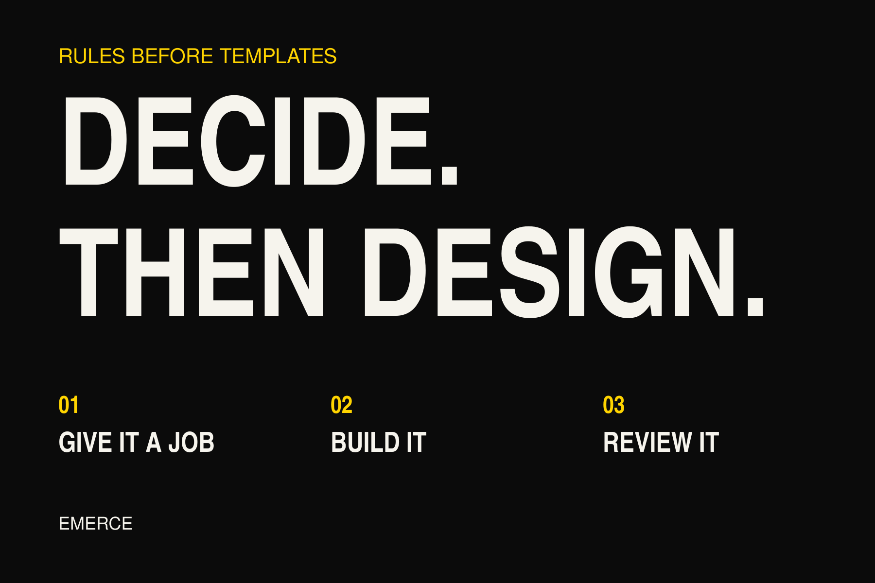
An email marketing operating system is a repeatable way to decide what to send, who should get it, and what to change after it goes out. It can be a shared document and a few sensible habits. You do not need another piece of software to start.
A template does a different job. It helps you build the email.
Both are useful. But if the team keeps asking the same questions before every campaign, another layout probably will not answer them.
You may end up with a very organized folder, though. Lovely folders.
Keep the templates. Give them a job.
A good template saves work. The logo is in the right place. Product blocks behave on mobile. Buttons look like buttons. Nobody has to rebuild the footer for the forty-seventh time.
Keep those gains.
The problem starts when choosing the layout becomes the first decision. You open a three-product design, so the campaign suddenly needs three products. You choose a sale template, so somebody has to find a discount.
The email starts taking instructions from the file.
Start with the job instead. Help a first-time shopper choose a size. Explain why a product costs more. Tell interested customers that an item is back. Bring a previous buyer to something they might need next.
Then choose the smallest layout that does that job well.
What the team needs to agree on
You do not need a thick manual. Start with five decisions that should be clear before anyone builds the campaign.
1. What should this email help someone do?
Write one sentence with a real action in it.
“Support the fall collection” is a topic. “Help previous shirt buyers compare the two new fall fabrics” gives the writer something to work with.
That sentence shapes the headline, product choice, main button, and landing page. If those parts pull in different directions, the brief needs work before the design does.
If you need ideas, the Email Campaign Planner can help you find a starting point. Picking the idea is still only the start.
2. Who has a reason to receive it?
Describe the people, not just the segment name.
“Newsletter list” tells you where their details are stored. “Subscribers who clicked on shirts recently and have not bought one since” explains the choice.
Use consented subscribers. Check the account's exclusions. Decide whether recent buyers need a different message or should sit this one out. A restock alert and advice on using a purchase are not the same email.
Do not copy a segment from last week without checking whether it fits this week's job.
3. What else are they getting?
Look at campaigns and automated emails together. Someone in a welcome flow might also be in the audience for today's promotion.
Decide which message matters most and how you will handle a close send. Record exceptions so the next person does not have to guess.
Klaviyo's Smart Sending can skip a marketing message when someone received another message too recently. Its email and SMS windows are separate, and skipped messages are not automatically rescheduled. Check the actual settings rather than assuming the feature coordinates everything for you. Klaviyo's Smart Sending guidance
There is no universal send gap in this article. The right choice depends on the email, the people receiving it, and what else is going on.
4. Who checks it before it goes out?
Name the person who checks the offer, links, audience, and final mobile view. Also name the person who can approve sending.
“Someone will have a look” is not a process. It is optimism with a calendar invite.
Use a short checklist that catches real mistakes:
- Does the link open the promised page?
- Is the product available?
- Do the offer and terms match the site?
- Is the text readable on a phone?
- Is the audience right for this email?
- Has the final version been approved?
A template can reduce layout mistakes. It cannot confirm that the discount still works.
5. What will we check afterward?
Agree on the result before the numbers arrive.
For a product comparison email, you might review clicks to the featured products, orders, and unsubscribes. Keep the reporting window and conversion metric consistent when comparing similar campaigns.
Klaviyo lets you inspect tracked link activity and select the conversion metric used in campaign reporting. Those are useful tools. The team still has to decide what to do with the results. Klaviyo's campaign analytics guidance
If the current review starts and ends with open rate, use the ecommerce email scorecard to broaden it.
Turn the result into a rule you can use
This is where a shared process earns its place.
After each review, write down one decision in this form:
When we see this, we will check this, then choose what to change.
Keep it specific enough that another person can follow it. Do not turn a hunch into an automatic order to change everything.
| What happened | What to check next | What not to assume |
|---|---|---|
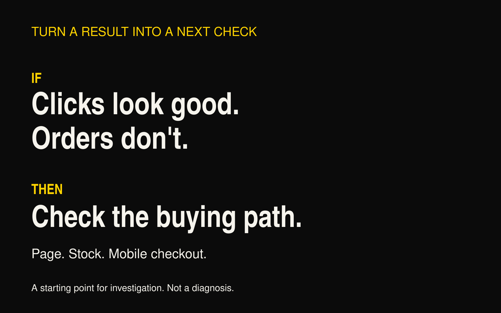
| Product clicks look healthy, but orders are weak | Whether the page matches the email, stock is available, and checkout works | That the email design caused the problem |
| More people unsubscribed than in comparable sends | Which group left and what changed in the audience, offer, or send frequency | That everyone wants fewer emails |
| A wider audience produced more total revenue | The extra revenue alongside unsubscribes, complaints, and revenue per recipient | That a lower average automatically makes the wider send a mistake |
| A layout takes too long to build | Which repeated sections can become reusable blocks | That every campaign needs the same layout |
These are starting points for an investigation, not universal diagnoses. A click can be automated. A small campaign can produce a noisy result. Inventory changes can make a fair-looking comparison rather unfair.
Write down the context with the result.
A worked example: a restock email
Imagine a clothing brand has restocked a popular shirt. This is an example, not a client result.
The job is to tell interested shoppers that their size is available again. The team selects consented subscribers with relevant product interest, checks recent purchases, and confirms the stock before building the email.
The designer uses a simple product layout. The main link goes straight to the shirt, not the homepage. A named reviewer checks the live page and mobile email before the send is approved.
The review date is written into the brief. So is the first question: did interested shoppers reach the product and buy?
If clicks are healthy but orders are weak, the first step is to check sizes, availability, the product page, and checkout. It is not to spend an afternoon rounding the button corners.
The template has done useful work. The brief and review rule have kept the team focused on the sale.
Start with one page
For the next campaign, put these fields in one shared brief:
- Job: What should the reader do?
- Audience: Who gets it, and who does not?
- Timing: What else might arrive around the same time?
- Build: Which layout and page support the job?
- Approval: Who checks it and who approves the send?
- Review: When will you look, and what will you compare?
- Next change: What did the result tell you to check or test?
Use it on the next few campaigns. Remove anything nobody needs. Keep the parts that stop repeated questions or mistakes.
That is an email operating system taking shape. Less impressive than a giant software diagram. Considerably easier to use on a Tuesday.
You can still collect good templates. Just make sure you are also collecting useful decisions.
If you are unsure where to start, run the free Email Revenue Audit. Use it to find the weakest part of the program and choose the next job to tackle.